Hey everyone,
This week, we explored WAVE accessibility reports and creating effective infographics.
Accessibility in Web Content
I’m pretty familiar with accessibility-checker tools. Google has a neat tool called “Lighthouse” in their dev console, and it completes a similar function to WAVE.
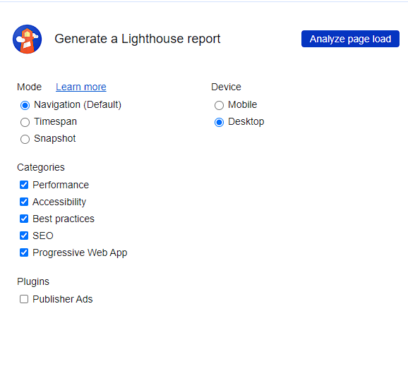
Screenshot of Lighthouse report in Google’s developer console
With this being said, I’ve never used WAVE before, so I was interested in checking out what it had to say. First thing I noticed was how many contrast errors present. This is a pretty common design issue on the web where grey text is often used in search bars (and other areas), and I guess it was pretty expected for me. I didn’t think, however, that the blue links would also constitute a “contrast error”. That was pretty new to me.
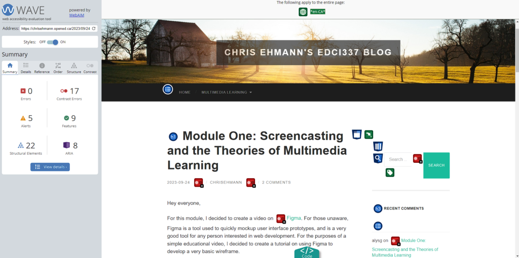
Screenshot of WAVE report for my Module One blog post
The biggest surprise to me was how the embedded YouTube video was declared an “issue”. After looking into why, it was because WAVE tells you to check if the embedded video has synchronized captioning available. I always like to listen with captions on, so it was pretty cool to see this as an alert.
Creating a Canva Infographic
This was my first time ever using Canva, and also my first time creating an infographic! The accessible, easy to use templates were really nice. When creating my infographic, I wanted to focus on two principles: practical value, and well structured. By focusing on a very simple but important topic and keeping the content “lean”, I felt like I was able to accomplish this. Contrast and white space were also things I had in mind while creating my infographic. Using a template made it much easier to achieve these goals, as I found they all had good pre-defined layouts, and modifying my content to match these layouts was pretty simple.
Infographic describing the three branches of US Government
I think there are a few things I could’ve done better (the title feels a bit large and takes up a lot of space), but other than that I think it looks pretty good.
I really like your infographic! The colour pallet is nice and simple making it easy to follow the content. The infographic is also very symmetrical and well-balanced. I like how you kept the imagery simple so that it doesn’t distract the viewer from the content. There’s also not an overwhelming amount of text which is good. Overall I think it is very informative and well done!